

The Making of the 2026 Ely Film Festival Poster
- Sarah Vogl

- Feb 19
- 6 min read
Updated: Feb 25
A journey through the creative process from concept, to imposter syndrome, to printing. Special thanks to Ely Film Festival and Ely's Historic State Theater!
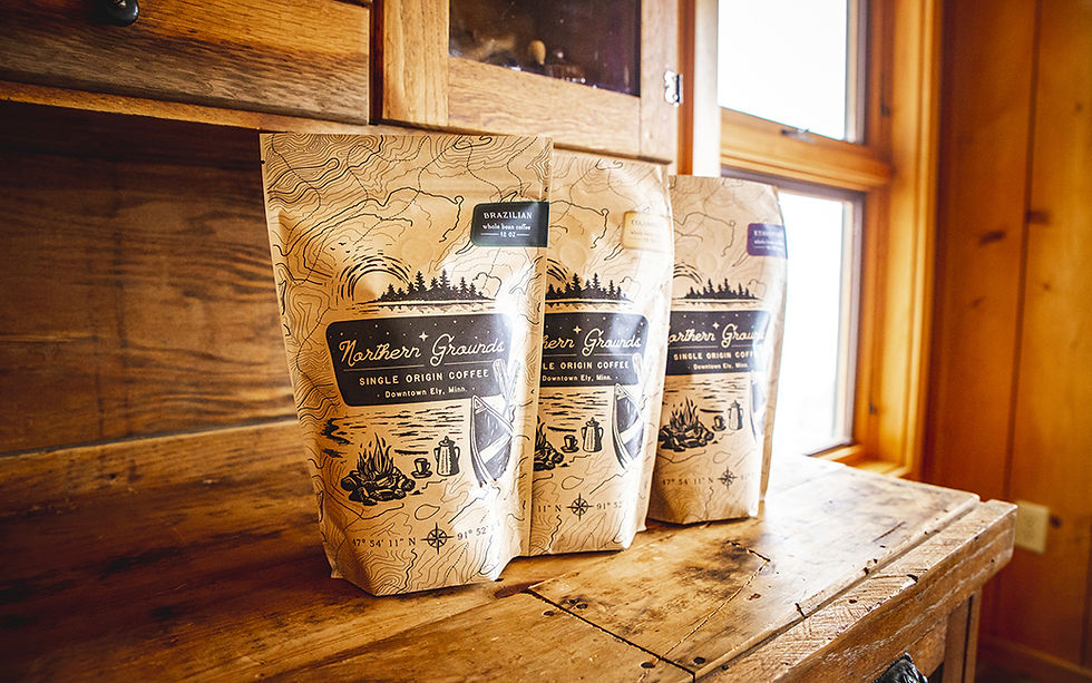
I've been making art off and on for about 35 years. Since moving up to Ely, it's mostly on - there's no shortage of inspiration in nature, I am surrounded by the most talented people on earth here, and I get to be creative all day, every day (though sometimes, that's easier said than done). But I haven't created much in the category of commissioned illustrations, though it's something I've always wanted to move toward. I often wiggle illustrative work into design projects I'm hired for - for example, Northern Grounds coffee packaging features an illustration. The project was 25% illustration, 75% design and coordinating with the client and packaging company about templates and specs.
Design clients generally don't ask for me to incorporate my art, so I don't actually get hired for purely illustration work. And if it's a wild illustration idea I'd like to incorporate - like digitally painting an intergalactic space explorer and three distinct planets for cannabis packaging - sometimes it takes quite a bit of convincing before the client will let me have at it. There are generally several days of back and forth with questions, hesitancies at being too "out there," and sometimes they elect to play it safe and not go with the fantastical idea.


This is not how it went when I pitched a couple of highly whimsical concepts for this year's Ely Film Festival to the Director of the Festival, Ryan Bajan. He hired me to illustrate this year's festival poster, marking the second time in my career I've been commissioned for a digital painting.


Well that was easy. A little too easy, perhaps. Many creatives will understand what happened next. Who do you think you even are? You've never illustrated something like this!
You can't do this.
Wait, yes I can. I did last year's poster artwork. And they hired me to do this.
Because they're fools! And this is way more complicated.
No they're not, and I am up for the challenge.
Yes they are! And no you're not.
Ahh, I remember you.
The internal monologue of imposter syndrome. I've known it well since the start of my career. These days, it only pops up occasionally when I take on a project I'm excited about, and/or is something slightly outside of what I normally get hired for. The conversation is shorter than it used to be, and it stops when I simply recognize it. So how did this poster get made? And how do I approach other creative projects like branding and packaging design?
THE CREATIVE PROCESS
Concepting I start with researching what else is out there that's similar - in this case I looked up a ton of Film Festival posters. I looked at general illustration inspiration, color scheme inspiration, etc. on Pinterest, creating a poster artwork inspo board. The things I knew to be true about the project then got loaded into my imagination:
I knew I wanted to go fantastical/non-literal.
I knew what colors I was going to aim for based on the existing theater and festival branding.
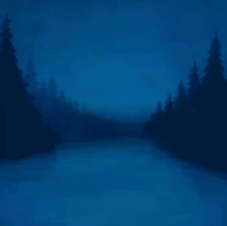
I knew the landscape should represent the Northwoods.
Then a very loose sketch forms in my head while doing life things - walking the goats and dogs, making dinner, cleaning. Sometimes, I have to initiate this, and other times an idea just appears - either slowly, like an actual sketch forming on a piece of paper in my head, or it abruptly just arrives. This particular idea just showed up one day when I was outside, but I knew I had a deadline so had been actively thinking about it. The other concepts I pitched to Ryan took more work to dream up. I often have specific themes I want to explore in my artwork, a project comes along where I get to do that. The summer before this project, my kids made a bug raft and we'd been discussing building a larger raft ever since. The kids and I also listened to Watership Down on tape, and had been hooked on the theme of Anthropomorphic characters in writing and art (our oldest is very interested in writing and an avid reader). These two themes obviously heavily influenced the concept of this project.
Pitching
Sometimes it's quick and easy - as was the case with this festival artwork, sometimes it's more complex and drawn out. Sometimes I have to convince them. Sometimes they reject the pitch, and I mentally file it away. With my client (turned friend!) Jess of Koru Kombucha, it took a bit of convincing and a few trust me's before she agreed to depart from the watercolor fruit of her existing labels to a different style digital painting for her coffee cocao kombucha. The finished product turned out wonderfully, and I'm glad she trusted me to do my thing in the end.


Sketching
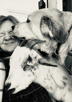
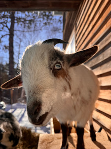
This is one of my favorite parts. I get to take an idea that came from my imagination and start to bring it to life - adding fun details to tell a story through art. This scrappy collection of animals is a film crew. Bear is hair, makeup, and transportation. Fox is lighting. Rabbit is cinematography. Bird is composer. They lost the director somewhere along the way, and they're searching for him while getting B-roll footage and working on the soundtrack. I've recently moved from pencil and paper sketching to sketching on the iPad, but I do occasionally revert back if I need a break from the screen. I don't like to be inside for this part if I can help it. This time around, I did most of the sketch while on a goat walk. There's not a lot of erasing in the rough sketch portion, I commit.

Illustrating
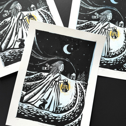
AKA digital painting. The most time consuming part, and has the most trust the process moments. I'm experienced in both hand-illustration and digital illustration, but have been favoring digital illustration lately because it's more efficient and flexible. I can take my iPad anywhere, but not my linocut supplies. I can undo and erase easier when painting digitally. I still practice both fine art and digital illustration, and am very intrigued by the concept of a creative practice that combines and honors both skills.


I illustrate digitally in Procreate, modifying colors and brightness in Photoshop.
The first step is picking a color palette based on my pinterest board (it changes a lot throughout the process).
Next, I choose my brushes - tending to favor those that are highly textured and chalk like.

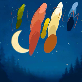


Based on the sketch I've created, I begin building elements, from the background forward. Every element is on it's own layer/layer set within Procreate for maximum flexibility in the design step later on.Water, Trees, Sky • Stars & Moon • Fox • Bear • Raft • Lanterns • Rabbit • Books • Camera • Foreground leaves • Theater Seats • Hand lettering
As I start to build up color, I figure out what works and what doesn't. The otter in the director's chair was too much here, so I nixed that part.
Fine Tuning
I can spend a very long time fine tuning the more challenging parts of an illustration. In this case, it was retaining an aesthetically pleasing composition and good visual hierarchy with a lot going on; and creating the illusion of glowing light and a raft in water. This second-to-last step also involves adjusting colors, saturation, and levels.
Print Proofing & Refinement
I did three rounds of print proofing at the Ely Echo, adjusting brightness, saturation, and color until we got it just right. With something as saturated and dark as this piece is, it's best to do a print proof, or a few, before the big run. Shout out to Cam, he's the best!

After we had a solid, client-approved final piece, I designed a bunch of promotional materials based on the artwork - social graphics, stickers, a patch design, signage, program cover guide, apparel, etc. Overcoming Creative Blocks
I don't have as many creative blocks as I used to, but when I'm stuck on a project or need to get in a more creative headspace, I have a few go-to tactics.
Watch creative movies (or look at stills from them). I like Wes Anderson, Anything by Laika Studios. Anything with a really atmospheric, colorful, and/or magical set design.
Lemony Snicket's A Series of Unfortunate Events, The Grand Budapest Hotel, Big Fish.


Music. No brainer. I figure out what I'm in the mood for and turn it on.
Walks and time in nature - this is where I have the most ideas come to me.
Spending time with my kids and animals. The ultimate creative fuel and mood boost. And I'm doing it anyway.


Here's a timelapse of the whole poster artwork process:
Wanna hire me to illustrate or produce motion graphics for your film or commercial project? Or for branding or packaging design? Email me at sarah@studiovogl.com
See you at the film festival!


test